


Ola! Every time I pretend to do something with analogue media, I start to get really scientific about it. I love doing color-charts and tests and most of the time get lost in the colors instead of doing actual drawing. This time I finally did all the color-charts (except for black inks. I need a special system for this).
The images of this review are NOT COLOR CORRECT. I suck at taking pictures and my home-scanning can never accuratelly portrait the original hues. I did not tamper with the tone correction on the color sheets to have the colors at least in some kind of proportion.
On we go.
Some words on the Paper
For sheer ink-works without washes and any desired flowing effects I prefer Bristol Board. Beware that bristol board can have a backside that feathers out any ink. Also: Be careful not to touch the surface too much - your fingerprints might be visible and fixated in the ink. Bristol Board is usually bright white, non textured and allows for a smooth ink-flow. It also comes in high weights so it does not ripple with larger uni-color areas.Preparing large Watercolor Paper for extensive washes is quite a time consuming occurrence. There are good drawing blocks available that have all 4 sides of the page glued to the block. With a drawing knife/small spatula/thin (clean!) ruler it's easy to separate the sheet from the block after finishing. This is very convenient and probably really good for watery experiments outside.
Another way would be to secure the dry sheet of paper with a strong spray glue on Finnpappe (did not find the English word): its a very strong 1,5-3mm strong cardboard. usually in a yellowish hue. That might not be desired if you think of framing your work later but a good passepartout can hide the mounted board.
Then there is the fixation of watercolor-paper with water activated sticky tape after the paper is thoroughly rinsed. I like to use this technique, because it gives you the freedom of format and access to some amazingly beautiful paper choices. Sadly the natural boarders of the papers are lost with this technique. The alternative would be to not glue the paper down but then you have to deal with ripples that can collect colors where it is not wanted.
Last there are really heavy watercolor papers that do not need all this pre-watering and taping down, but these are really expensive and I have not tried them out, yet. I would probably use these a lot if they were more affordable. But not sure yet.
Paper for the ink-testing: 300 g/m2 Hahnemühle watercolor single sheet.
paper for the watercolor test: 200 g/m2 all purpose sketch + simple watercolor paper (No 2 from Gerstaecker).
When do you use Ink, when do you use watercolor and what is the difference?
I love working with water-media for several reasons: i can influence the "Thickness" of the paint, create nice washes and "feathery" effects and the mixing of most of these colors works extremely well.Since I usually work with colored outlines, liquid material that can be applied with drawing pens is a must. I prefer very smooth, non-textured Bristol Board for sheer ink-works without any washes though.
To work with inked outlines, the behaviour of said ink in connection with water is extremely important to me. If i want the outlines to be softened, I look forward to the ink being water soluble. In most cases I do not wish for this. Inking outlines is a conscious choice for a defined line - the "planned" part of the picture. If it featheres and runs away, the clear definition is lost. This can be a desired effect, but its hardly controllable and I personally just allow the watercolor to do its thing ; )
Most of the time, vibrant watercolors keep their brilliance even when mixed (never when mixed with white, of course). Inks and watercolors usually soak into the paper and cannot be lifted by scratching at the surface.
Except for the really dark colors, Inks and watercolors are rarely opaque. They mix on top of each other and you paint with darkness, not with light (like on the screen). To have some really bright areas, it is important to not paint them or just have one layer of ink there. I like that mechanic, because Inks and watercolors will do a lot of texture work for you and gradients and color corrections are probably easier than with some opaque medium. Except if you want to go lighter.
Method of Testing

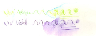
I kept the same amount of pressure for every line, growing scratchy, paper-demaging scrawly in the very end to simulate deeper color-application and the effect of erased/careless paperdestroying ; ). After 4 hours I put a generous amout of water on the right half of the lines - really rubbing in the water at the far right. I did not use destilled water and the water in my area of Berlin is not very forgiving. But I will not use destilled water, because my cats (and sometimes I per accident) keep drinking from the ink-water.
Rohrer & Klinger Drawing Ink / Zeichentusche


The Indigo looks almost grayish black, it is very dark, yes, but has a nice dark blue hue to it when mixed with more water. Between yellow-green and sepia is actually Gold. I strongly recommend not to buy it. The effect is very subtle and there are stronger shimmer and gold-materials out there for a stronger effect.
These colors are truly water-proof. Once applied and left to dry a bit, they will not come off. I also feel that they are quite light-proof. The strong, vibrant colors and the very easy application with drawing pen makes them my #1 choice. They are also easily available and affordable. Black can be bought at 1000ml! all other colors come in 3 smaller sizes. 12ml, 50ml, 250ml. (above are just 12 and 50ml). They last very long and even my poor abused 50ml black did not dry out, even though I am not careful with it and take the color directly from the flask.
Rohrer & Klinger Antiktusche /Antique Drawing Inks


The great allure are the stained looking colors, the pretty bottle design and the well coordinated palette. I am surprised about my Bister. Bister usually turns out more of a desaturated brown but this one turned blueish. I mainly use Bordeaux and the Mauriziusblue so i cannot tell, if that color might change when applied.
I see this ink as addition to the "normal" drawing ink Palette. Of course every color changes slightly after drying, but these colors do so a lot. Bordeaux desaturates a lot for instance. They apply as well as the standard drawing ink and are also very safe with water. I sensed a very, very ever so slight blur with the green though. I recommend buying these if you have a great idea that a "stained" look might suit well but i am sure you can obtain close colors also by simply mixing other colors.
Winsor & Newton Drawing Ink

Pelikan Drawing Ink


Half of these colors are waterproof, the others not. They do not advertise with waterproof-ness, but inconsistency within one product is not a merit. I still like the blue-violet and the blue, because they apply very nicely.
Rohrer & Klinger Schreibtinte / writing ink


Pelikan Stempelfarbe / stamp color


Doing outline work or any water-coloring with these colors is a fault on my part. These "inks" are meant for ink pads, for legal documents. The blue reacts sometimes with other colors and takes on a violettish hue. I was surprised that the blue is actually waterproof, since i remembered ruining one picture by using it as part of the outline colors. I like the red for its very, very strong, vibrant tone though. Its hard to reproduce these deep and rich colors with the other water-based media. If you want to control your picture, you should test these colors out with the other colors you like to use. It can get really nasty. and spectacular : )
Ecoline Watercolors


Schmincke Hordam Aquarellfarben / Watercolor

You can start easily with 7 colors: a "cold" yellow, a "warm" yellow, a "cold" red and a warm red, same with blue and one basic black. I personally enjoy unnatural color schemes and wish there was more variety in the violet and purple section but these colors are chemically problematic as I understood it. Schmincke also offers "Academy" versions of their colors. These are base-sets that are about half the price of the "official" sets. Important: The color-numbers are sometimes the same! I got quite confused while figuring out which colors i have and which would be nice to add.
In their little boxes the colors rarely look like they finally turn out on paper. Schmincke advises everybody to to a color chart like this one. For this you use a really clean brush (I have 2 sets of watercolor brushes: for light colors and dark colors), soak it with color and dip the color on the right of 2 squares. Then you put clean water on the left of these 2 squares and combine them. I am not very consistent in this method - observe the 2 mauve-tones: They are actually the same color and behave differently, because... I am a genius ; )
I find it easier to supply myself from the large pans but they can be pricey - therefore I take small pens when I feel that I will not use a color in a large scale.
Most of these colors are brilliant, mix well and endure direct sunlight, but the "weird ones" like purple and blue violet do not. Schmincke has detailed explanations on their downloadable product sheets for every color though.
Does it have to be Schmincke?
No. There are cheaper, really good watercolor sets out there. Boesner offers the Igor Trestoi Set - 24 whole pans for about 25 Euro. They are still waaaaay better than the average school-watercolor-set. I have one color from Lukas that is also serving me well, but since I made great experiences with Schmincke and these colors will probably last me a lifetime, I find it worth the extra Euro (for every pan) to buy these colors. I assembled my watercolor box over the course of maybe 8 years now and started with a 12er academy-kit. I enjoy leafing through the color charts and buy one pan here and one pan there (sometimes the only thing I get), because... coloooooors.With many watercolors Schmincke can be "re-watered". If your mixture dried in on your palette, you can simply add a bit of water and can continue even years after the first mixture was done.
In conclusion:
It is not important to have many colors but the important bases to mix your preferred colors and the weird ones that are not really mixable in this brilliance.Test your colors and do color-sheets to ease the choice (works well for me, more experienced people have a feeling for this and don't need the cheat-charts. Pff!)
Inks or Watercolors: Depends greatly on how you like to apply the color and if its supposed to interact with other colors.
I find it important to let go of control as well - with watercolors. With outlines on the other hand I really want to know that they will stay where they are supposed to be - but why use watercolor if there is no freedom of flow allowed? This is my personal view and there are amazing, very controlled watercolor works that make great use of the brilliant colors.
Examples:

Rohrer and Klinger Drawing Ink Indigo + Black
White marker

Rohrer and Klinger Antique Drawing Ink Bordeaux
R&K Drawing Ink Indigo
Schmincke Watercolor Violet, brilliant blue violet and mauve

Ecoline grass green and fir green
Schmincke May green
Pelikan Drawing Ink Turquoise

Rohrer and Klinger Drawing Ink Orange, Scarlet
R+K Antique Drawing Ink Bordeaux
Schmincke Watercolor glaze orange and scarlet
I hope this helped and I am interested to know, what experiences you had with inks and watercolors.
Endlich hab ich's mal geschafft, deinen "Artikel" zu lesen :) Werde ihn gleich zu meinen Lesezeichen hinzufügen.
AntwortenLöschenNach Fenomenas Ecoline-Eintrag http://veitstanzdraws.blogspot.de/2012/02/word-on-ecoline.html wollte ich immer mal diese flüssigen Aquarellfarben ausprobieren. Hat boesner die?
Hey Lew, danke für deinen Kommentar : )
Löschenja, boesner hat die. Und die Farben sind wiiirklich schön (sehr künstlich aber!), dafür schön knallig und lassen sich eigentlich sehr gut mischen. Aber sie laufen dir halt weg - für outlines auf keinen fall geeignet, wenn man danach nochmal mit wasser rübergehen mag.
Super Artikel, Gab, danke!
AntwortenLöschenMittlerweile hab ich ihn bestimmt schon 5 mal gelesen und einige Tipps - insbesondere das Erstellen einer Farbtabelle für den Aquarellkasten und die Erklärung deiner Arbeitsweise mit Tinte - haben mir sehr geholfen! Ich wünschte, mehr Künstler und Illustratoren würden ihre Erfahrung mit Materialien so schön dokumentieren.
Zu den Aquarellfarben: Ich hab das erwähnte Igor Trestoi Set und bin damit echt zufrieden; höchstens eine "unnatürlichere" Farbe wie Pink fehlt da noch. Den Unterschied zu Schmincke werde ich wahrscheinlich erst dann feststellen, wenn mal ein Näpfchen leer ist.
Weniger zufrieden bin ich mit meinem Lukas Aquarellkasten; Da fallen die Näpfchen ständig aus den Metalklemmen und purzeln dann manchmal im Kasten rum. Von den Fotos zu urteilen, könntest du den gleichen Kasten haben. Hast du das Problem auch?
Ich glaub, ich muss mal zu Boesner fahren.
I do the same things with the colour charts! Sometimes it takes too much of my time tho. I used to use the "Winsor & Newton Drawing Ink", beautiful vibrant colours from them but they arent archival or lightfast, so after a year they have lost their colour. A big problem if you sell someone the original art! I have been looking for an opinion on Schmincke Hordam, so thanks for that, ill have to get them to try at some stage now
AntwortenLöschenI am a big fan of the Schmincke-colors and they are worth every penny (especially if you sell your art). As with many other good products, they have a scale for how lightfast a specific color is. I used them to color buttons and most of them are as vibrant as on the first day, even though they are worn outside.
LöschenThe Winsor and Newtons dissappointed me, because they are not waterproof at all and when combined with water, they sometimes dissolve in different colors than what i first applied (a green suddenly displaying a bluish border). But for highly textured works, i like that effect.
With your kind of artworks, good watercolors will be an absolute joy to use : )