Vincent offers a truce to the monster's but he doesnt seem to be very happy about it and here is, how that picture came into being:
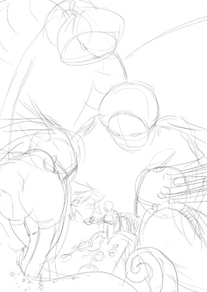
The sketch. Photoshop. I keep a file where I just pile up scenes and sketches from the Vincent/Gabriel universe. This was one of them. They are usually even more rough.
(photography) ink-drawing. On a ... light-table I traced the sketch on an A3 format with blue pencil and sharpened the lines with blue ink. At this point i had in mind to color the character quite dark and make the monster behind his back a starfield with a gradient to white to backlight the character. But...
.. I let the colors go wild (photography again). Using a mixture of inks and watercolor as well as salt and some effect-spray (that did not work well - the effect is just a bit visible on the upper right). I could not control the colors and did not bother to after a while. I made sure, that there were enough interesting shapes to create the monster's from later.
The scan.
Heavy use of overlay and multiply to create focus.
At this point I asked a friend, seven, for help, because even though I like the focus on the poison green monsters, this was not, what i had in mind. Als the feel for this area as a room got lost. She advised me to tone down the green.
Which I did, in the End:
Also, check out dashed. It's a crude but fun drawing tool, without an eraser! and an amazing function: one can drag a cutout over any place of the paint-chat-like-window and see a little video of how that area was created. I like that feature: (Click to go to "dashed"


Keine Kommentare:
Kommentar veröffentlichen