I had the
great pleasure of working for the Web Series Extra Credits again. This is so
much joy, because it is more about the concepts and fitting imagery than about
elaborate drawing. I like jobs, where I have to think. I figured out that my style is
not working as well for this as the general style developed by the series makers
Dan and Allison. Also its waaaaaay too slow to draw anatomically somewhat
probable figurines.
My full pop
culture nerd senses tingled, when the topic was announced: The Heros Journey
and illustrated by the beautiful Game Journey by thatgamecompany. I obsessively
watched playthroughs, especially enjoying this one: Video Part 1. That narrator sounds so awed and
sympathetic : )
The Hero's
Journey explores the stages a hero walks through in the straightforward “epic”
path in many hero-centered narrations. Therefore I had an excuse to single out
tons of great epic stories and use them to illustrate James’ text and Dan’s
narration thereof. Watch the Video here.
Let my start with an assemblage from some drawings from the Episode. Be very invited to read the more obscure reference links below.
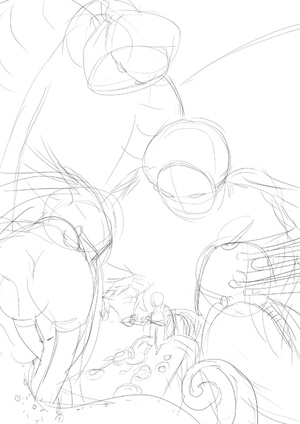
I started out by planning the episode. This way i have an overview on how many images are needed, the pacing and how much non-drawn material and how much dan-standing-and-talking is involved. I strive for balance:
Posts mit dem Label making of werden angezeigt. Alle Posts anzeigen
Mittwoch, 11. Juli 2012
Sonntag, 30. Oktober 2011
Making of "Truce"
There are a lot of ideas bothering me about this picture. I think, it's the first comparable one, that made me sad drawing, because to declaring a truce with one's monsters means that one has to have some monsters in the first place. The older I get, the more irrational and shapeless are these monsters, but living in a world where the Wild Things Are is also a vow for solitude.
Vincent offers a truce to the monster's but he doesnt seem to be very happy about it and here is, how that picture came into being:
The sketch. Photoshop. I keep a file where I just pile up scenes and sketches from the Vincent/Gabriel universe. This was one of them. They are usually even more rough.
(photography) ink-drawing. On a ... light-table I traced the sketch on an A3 format with blue pencil and sharpened the lines with blue ink. At this point i had in mind to color the character quite dark and make the monster behind his back a starfield with a gradient to white to backlight the character. But...
.. I let the colors go wild (photography again). Using a mixture of inks and watercolor as well as salt and some effect-spray (that did not work well - the effect is just a bit visible on the upper right). I could not control the colors and did not bother to after a while. I made sure, that there were enough interesting shapes to create the monster's from later.
The scan.
Heavy use of overlay and multiply to create focus.
At this point I asked a friend, seven, for help, because even though I like the focus on the poison green monsters, this was not, what i had in mind. Als the feel for this area as a room got lost. She advised me to tone down the green.
Which I did, in the End:
Also, check out dashed. It's a crude but fun drawing tool, without an eraser! and an amazing function: one can drag a cutout over any place of the paint-chat-like-window and see a little video of how that area was created. I like that feature: (Click to go to "dashed"
Freitag, 19. August 2011
Minecraft! Step-by-step
To view the full-size of the finished picture, either visit this image on deviantart or my fun-homepage.
I drew this for the 5 people who make me enjoy the time in Minecraft (this belongs to the Mojang AB). Such a creative playground with so very different people : )
We have the composer, explorer, architect, miner, collector and redstone ("electrical stuff") engineer.
After this followed color-editing and some last changes like stripes on the green-haired-guys suit and a broader smile on him as well. See the Result here.
I drew this for the 5 people who make me enjoy the time in Minecraft (this belongs to the Mojang AB). Such a creative playground with so very different people : )
We have the composer, explorer, architect, miner, collector and redstone ("electrical stuff") engineer.
After this followed color-editing and some last changes like stripes on the green-haired-guys suit and a broader smile on him as well. See the Result here.
Donnerstag, 16. Juni 2011
making of psychosis neurosis
Hey Folks!
Found an old step-by-step that i never properly integrated somewhere. So I better put it in this place.
It's for teh Picture Psyrosis Neuchosis (Deviantart-link) I did in 2010.
Found an old step-by-step that i never properly integrated somewhere. So I better put it in this place.
It's for teh Picture Psyrosis Neuchosis (Deviantart-link) I did in 2010.
Montag, 30. Mai 2011
TwiSTeD stuff
Some Images from my comic project.
Barbera sketch in her new design
Screentone and Ink and Pens on notepaper.
Step-by-step for THIS PICTURE:
Jaune's Redesign
Edna breaks out - a funny adventure by Daedalic Entertainment. Sorry to say that i did not think about this fanart but wanted to draw her again.
Montag, 25. April 2011
making of offset-calendar
Hey folks!
Printing on an ancient, amazing handcrafting super robot of an offset machine, I could learn a lot about how these machines actually worked and could control most of the printing process.
Luckily I have the advantage on still being in University where I can use the awesome craftshops. After 3 month of working I finished my source for the A2 calendar:

At first i wished to do a screen printing - one white layer, one black layer so i could define the color via the paper and play with textures. My professor convinced me to try out the offset-machine, because printing with the thick white color in a broad layer is a job for superman and not tiny, weakly gab!
The rough plates where etched by a professional printer and so we started on the ancient machine:

The colors where really mixed by hand on an old lithography-stone:

I planned to do the calendar in emerald/may-green and black, but there where colors like gold and neon-red and other impossible to digital-print colors, so we ran wild with them and tested some of those colors out. "We" were another student an J. B. the mastur of the offset-print-machine.

When the color had the desired shade and thickness, it got applied to the printing-cylinders.

There we could do amazing things: iris-print! That means that color is directly mixed by the printin-mashine on the cylinder and creates amazing, vibrand gradients.

AAACCITEEENTS happened as well.
For the start I was not very careful with my hands and the chemicals. Nothing burned me and nothing was too dangerous but after a while i noticed that i had the habit of running over my lips with chemecy hands... my lips burned for 2 days.
But the worse thing was the Paper-Wagon of Doom! We had two paper wagons to let the sheets dry. And whenever we came close to the left one (the one I used...) we got hit by electric current... but sometimes that strong that the hand went numb. We finally figured out, what the problem was: It had no earthing... grounding (i looked it up, but both of these words seem wrong).

Since most of my sheets where already in the wagon, i continued to use a rubber spatula to shift the papers around.
After 8 hours we printed 75 Sheets of which i selected 60 to be the official edition. 10 where brought to the Leipzig Book Fair and the other ones are now for sale and presents.
Check out some of the versions in the previous post!
Thank you for reading and hurray for offset printing!
Printing on an ancient, amazing handcrafting super robot of an offset machine, I could learn a lot about how these machines actually worked and could control most of the printing process.
Luckily I have the advantage on still being in University where I can use the awesome craftshops. After 3 month of working I finished my source for the A2 calendar:
At first i wished to do a screen printing - one white layer, one black layer so i could define the color via the paper and play with textures. My professor convinced me to try out the offset-machine, because printing with the thick white color in a broad layer is a job for superman and not tiny, weakly gab!
The rough plates where etched by a professional printer and so we started on the ancient machine:
The colors where really mixed by hand on an old lithography-stone:
I planned to do the calendar in emerald/may-green and black, but there where colors like gold and neon-red and other impossible to digital-print colors, so we ran wild with them and tested some of those colors out. "We" were another student an J. B. the mastur of the offset-print-machine.
When the color had the desired shade and thickness, it got applied to the printing-cylinders.
There we could do amazing things: iris-print! That means that color is directly mixed by the printin-mashine on the cylinder and creates amazing, vibrand gradients.
AAACCITEEENTS happened as well.
For the start I was not very careful with my hands and the chemicals. Nothing burned me and nothing was too dangerous but after a while i noticed that i had the habit of running over my lips with chemecy hands... my lips burned for 2 days.
But the worse thing was the Paper-Wagon of Doom! We had two paper wagons to let the sheets dry. And whenever we came close to the left one (the one I used...) we got hit by electric current... but sometimes that strong that the hand went numb. We finally figured out, what the problem was: It had no earthing... grounding (i looked it up, but both of these words seem wrong).
Since most of my sheets where already in the wagon, i continued to use a rubber spatula to shift the papers around.
After 8 hours we printed 75 Sheets of which i selected 60 to be the official edition. 10 where brought to the Leipzig Book Fair and the other ones are now for sale and presents.
Check out some of the versions in the previous post!
Thank you for reading and hurray for offset printing!
Abonnieren
Posts (Atom)